

BeeSure
- (Client) Beesure
- (Year) 2023
about the project
BeeSure is a leading medical supplies company committed to sustainability and innovation. As the lead in-house brand designer, I am responsible for creating and overseeing all visual elements that define and elevate the brand’s identity.
The Challenge
BeeSure needed a rebrand to better reflect its mission, eco-friendly, nature-inspired, minimalistic, and fun.
The Solution
I led a full brand refresh, creating a cohesive identity that balances sustainability with modern aesthetics:
- Introduced a modular scroll layout for easier storytelling
- Refined typography and spacing for readability.
- Integrated brand colors, icons, and visual language from the rebrand.
- Designed for both desktop and mobile responsiveness.
- Improved SEO structure to boost indexing and discoverability.
Services Provided
- Brand Development
- Creative Direction
- Packaging Design
- Publication Design
- Marketing Collateral
BeeSure’s new look brings clarity, warmth, and a focus on sustainability.
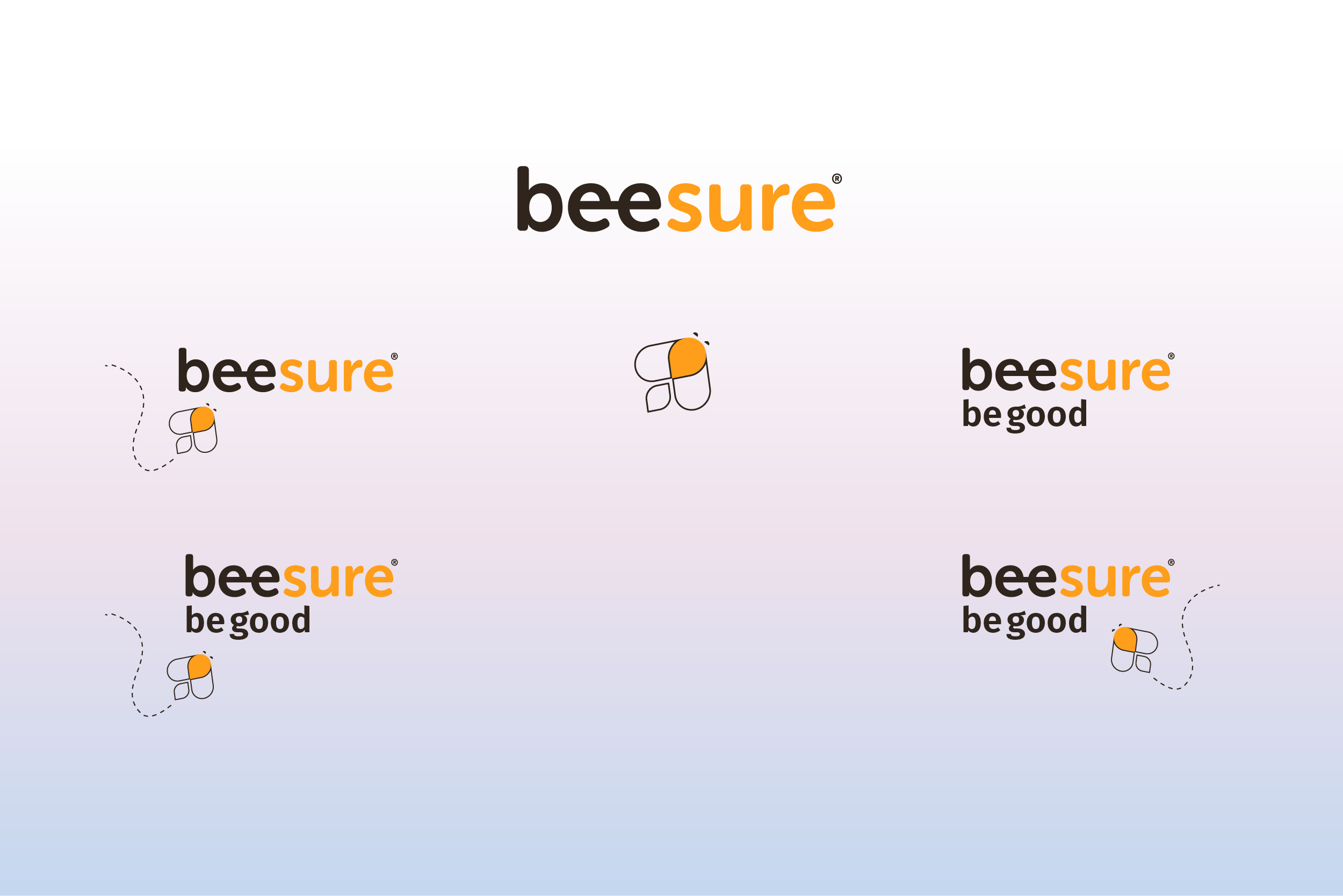
BRAND IDENTITY
Our Vision:
Being truly eco-friendly means going beyond sustainable products—it's about creating a movement. BeeSure exists to prove that responsible healthcare and environmental stewardship can work in harmony.
Challenge:
Create an iconic mark that:
- Communicates our dual focus (healthcare + sustainability).
- Works across all applications from PPE packaging to marketing materials.
- Feels approachable yet authoritative.
Solution:
- The Hidden Bee Revelation Negative Space Alchemy: the lowercase "ee" in "Bee" transforms into the bee mascot's eye like a watchful protector.
- Adaptable System - works as standalone icon (app favicons). Pairs elegantly with wordmark (packaging).
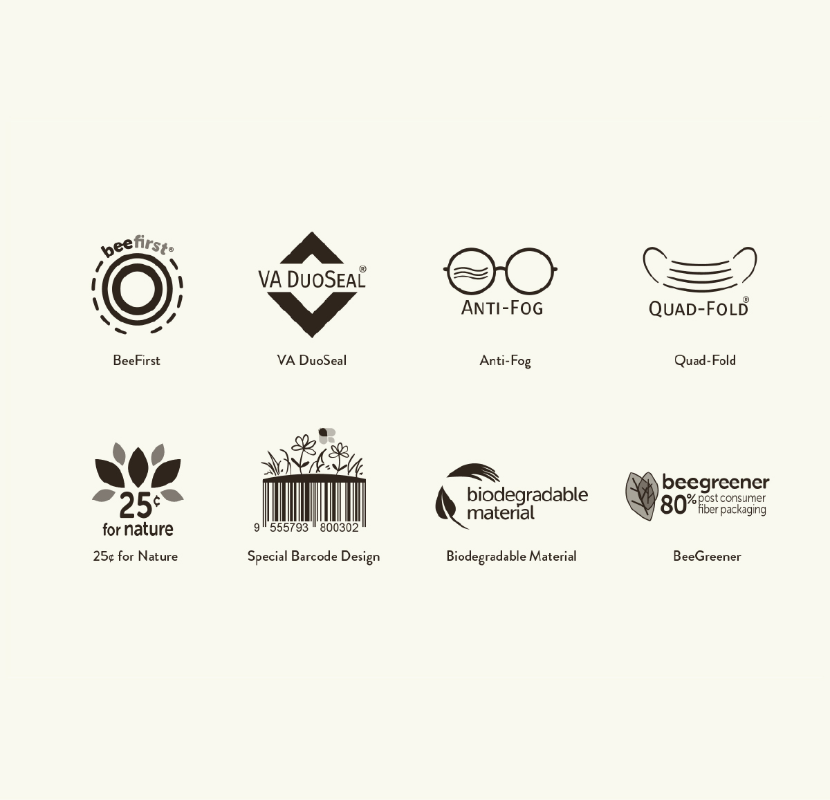
Brand Icons
a few of new revamped icons -
- BeeFirst -
product that manufactured with zero direct skin contact - VA DuoSeal -
duo adjustable strip the shape like a VA - Anti-Fog -
anti-fog flap - Quad-Fold -
four folded design - Barcode Design -
a special design that suited for the brand image - Biodegradable Material -
an icon for the biodegradable material - BeeGreener -
an icon to use with anything with number percentage
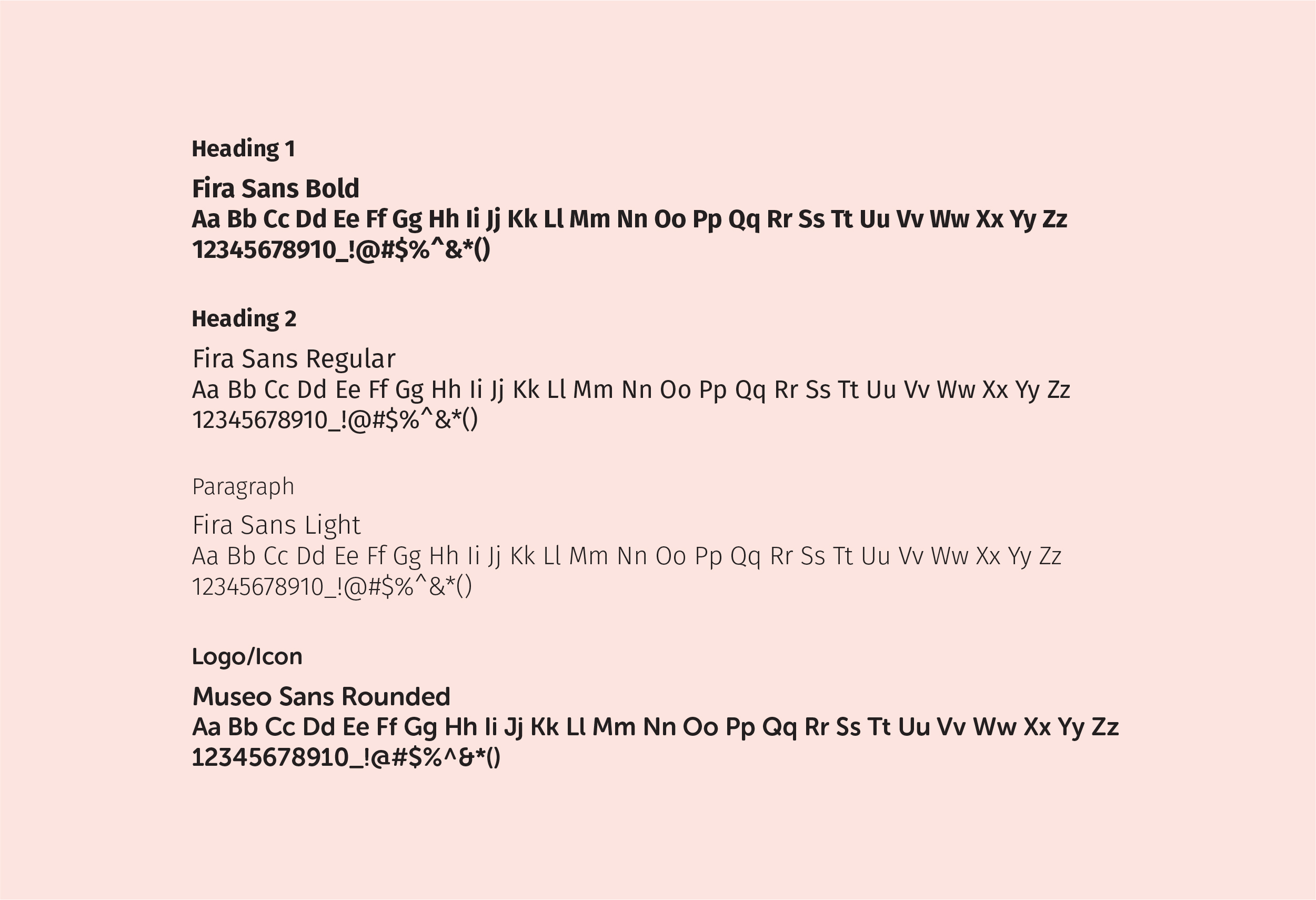
CORPORATE TYPEFACE/
COLOR PALETTE
Primary Typeface
- Fira Sans
Usage: Headlines, sub-headlines, body copy.
Accent Typeface
- Museo Sans Rounded
Logo pairings, icon integrations, headlines, selective marketing accents.
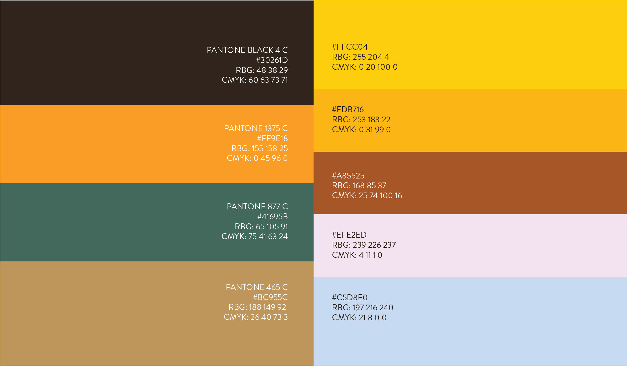
Primary Color Palette
BeeSure’s refreshed color scheme embodies organic energy and warmth, blending natural earthiness with invigorating vibrancy.
- Earthy Blackish Brown -
a deep, anchoring neutral for stability and sophistication. - Bee Orange -
a burst of energetic warmth, symbolizing action and optimism. - Forest Green -
a rich, natural tone representing growth and reliability. - Soft Muddy Brown -
a warm, approachable base that adds balance and versatility.
Secondary Color Palette
- Bee Yellow -
a bright, uplifting accent for highlights and calls to action. - Goldenrod Yellow -
a deeper, golden warmth that conveys premium quality. - Redwood Brown -
a rustic, grounded tone for depth and texture. - Light Pink -
a soft, modern touch that adds approachability. - Cornflower Blue -
a cool, calming contrast for balance and versatility.
MARKETING COLLATERAL
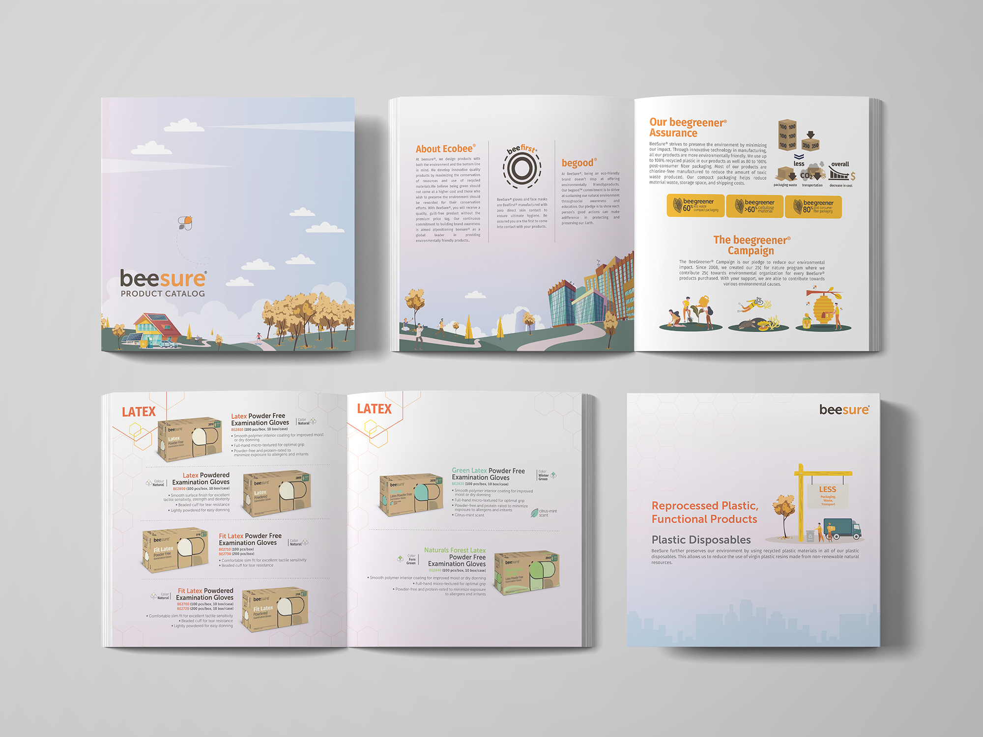
New Revamped Catalog
Objective - Create a clean, engaging, and eco-conscious product catalog that:
- Prioritizes ease of navigation - customers quickly find what they need.
- Highlights product benefits first - clear, user-centric explanations.
- Showcases environmental impact - reinforces sustainability as a key differentiator.
- Feels warm, vibrant, and fun - balances professionalism with approachability.
Key Design & Content Strategies:
- Simplified Layout for Easy Navigation
- User-First Product Descriptions
- Eco-Impact Made Visible
- Vibrant, Warm & Fun Aesthetic
- Interactive & Engaging Extras
Sales Sheet
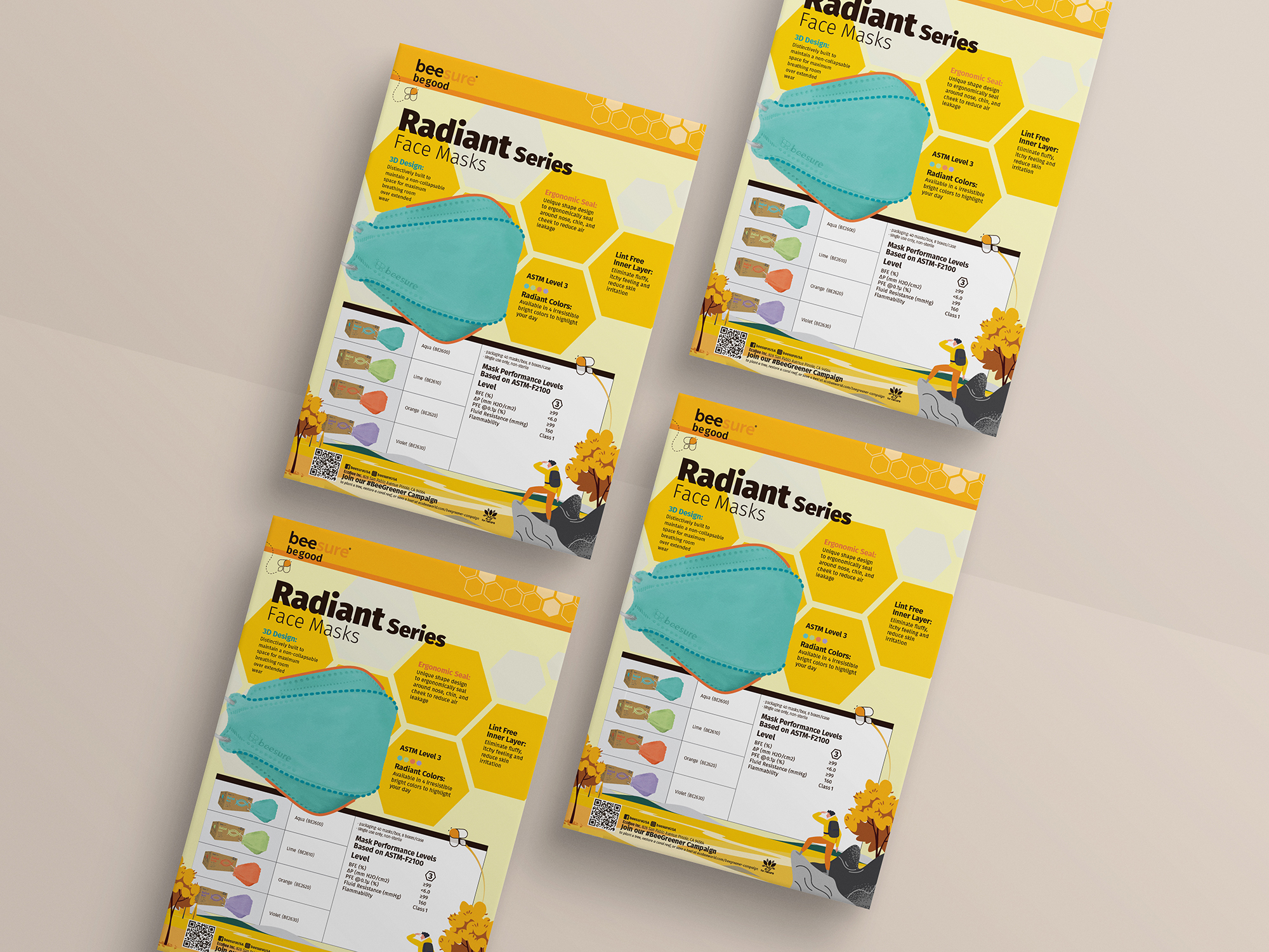
Radiant series face masks -
Brand-Aligned Design -
This newly designed sales sheet for our upcoming Radiant Series face masks fully embodies BeeSure's refreshed visual identity - clean, nature-inspired, and purpose-driven
This newly designed sales sheet for our upcoming Radiant Series face masks fully embodies BeeSure's refreshed visual identity - clean, nature-inspired, and purpose-driven
Key Features:
- Showcases our premium face masks with a focus on both performance and sustainability.
- Applies our signature warm, eco-conscious color palette (honey yellows, earthy neutrals).
- Incorporates subtle nature motifs like honeycomb patterns.
- Uses clean, approachable. typography for quick readability.
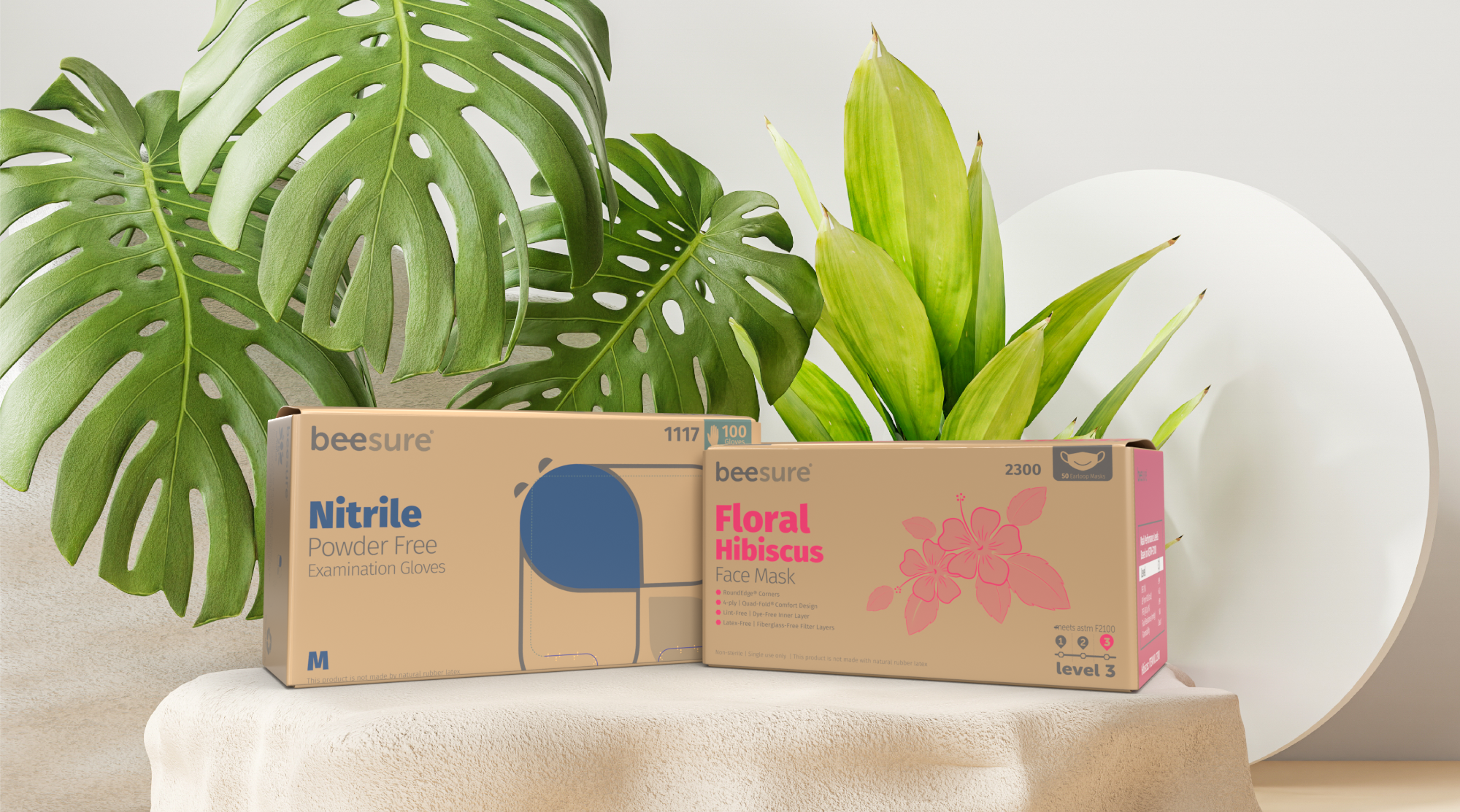
PACKAGING DESIGN
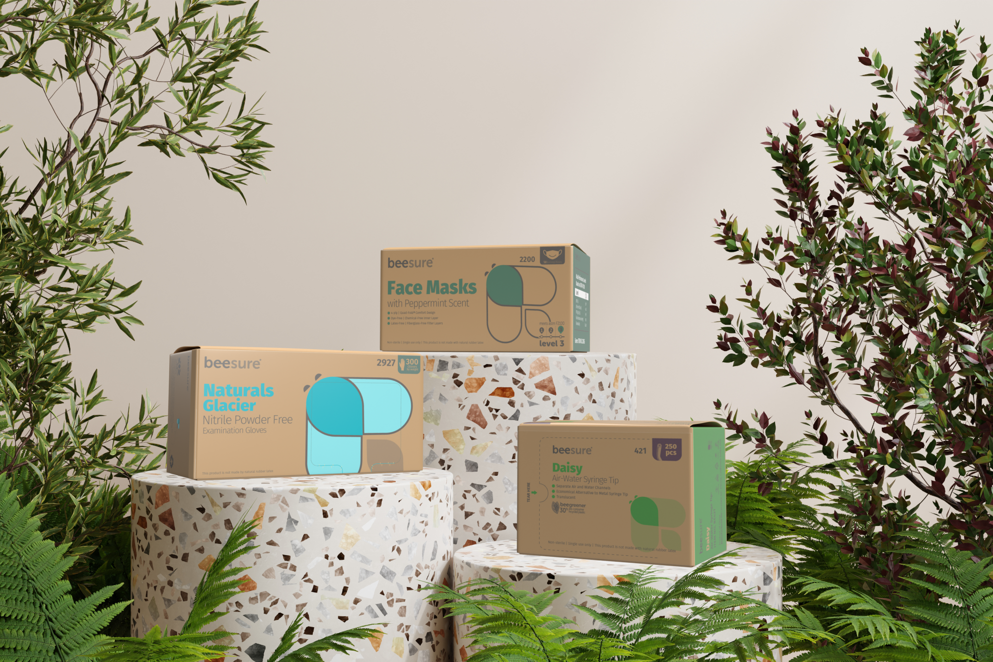
New Revamped packaging
The complete transformation of BeeSure’s packaging marked the foundational milestone in our brand revolution—establishing the visual language and sustainable ethos that now defines every customer touchpoint.
Key Design Principles: Nature-inspired minimalism
Key Design Principles: Nature-inspired minimalism
- Warm, earthy backgrounds with BeeSure’s refreshed color scheme.
- Playful yet professional bee mascot illustrations that build brand recognition.
- Bold yet balanced typography that prioritizes clarity over clutter.
Our packaging redesign wasn't just a cosmetic update, it was the launchpad for BeeSure's complete brand evolution. As the first tangible expression of our new identity, it set the standard for every touchpoint that followed.
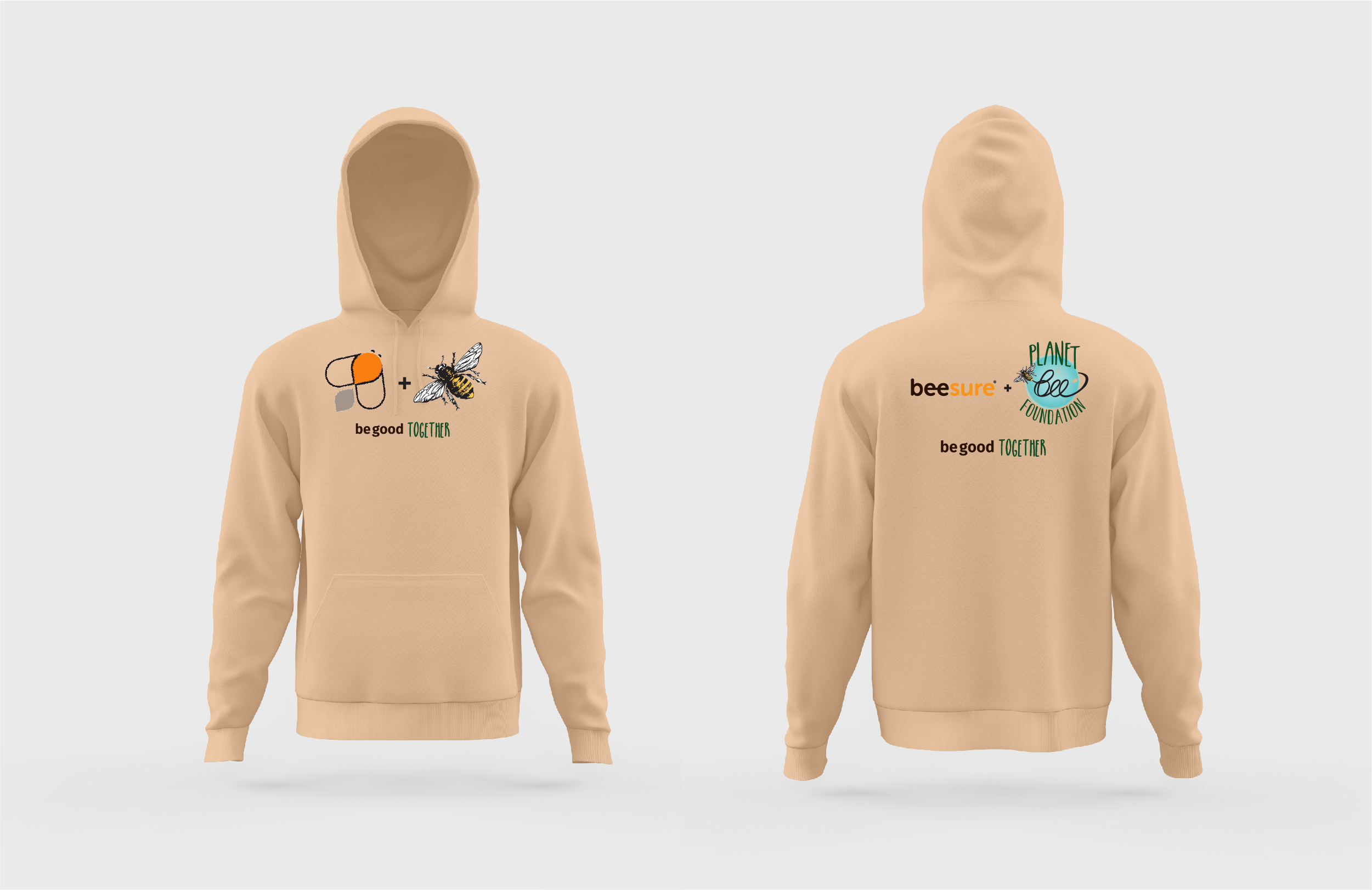
MERCHANDISE DESIGN
cross-over with
Planet Bee Foundation
.jpeg)
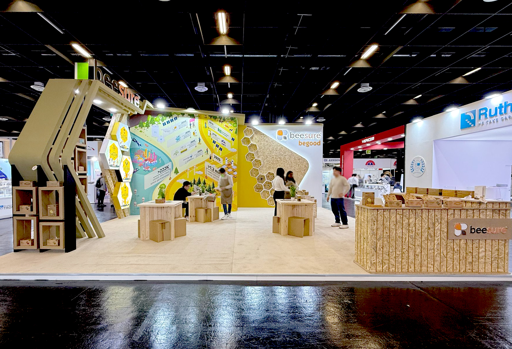
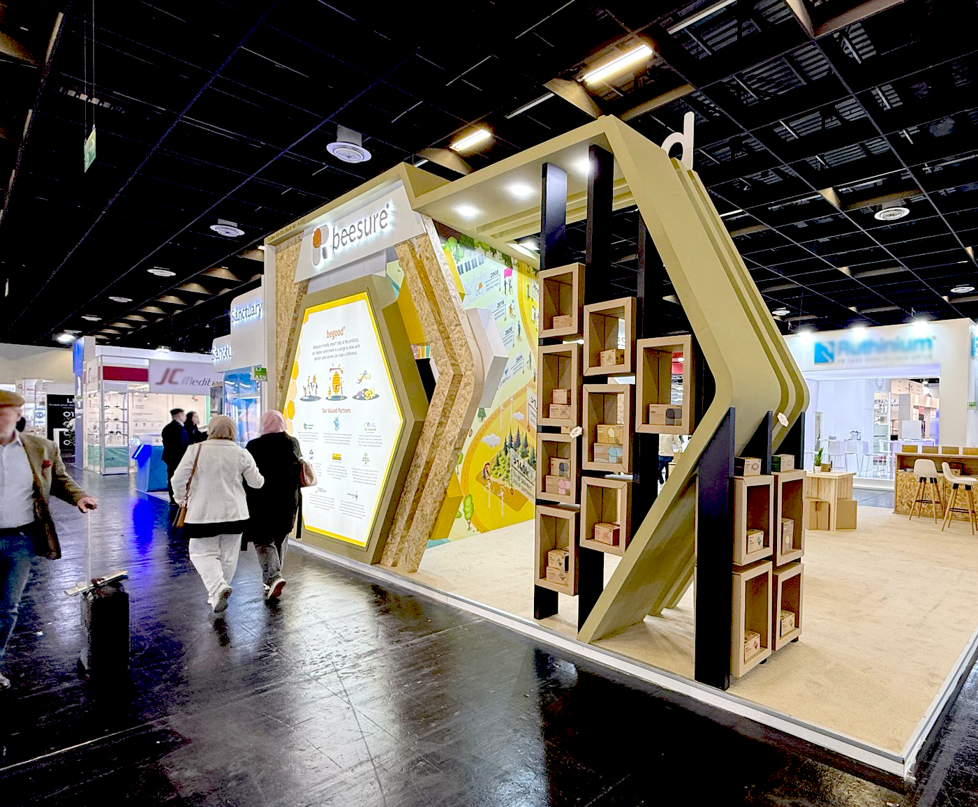
BOOTH GRAPHIC DESIGN
Beesure at IDS 2025
BeeSure’s booth at IDS was designed to reflect the brand’s clean, approachable identity and reinforce its commitment to sustainability through bold visuals and cohesive messaging.
Key Challenges:
Key Challenges:
- Standing out among 2000+ exhibitors.
- Communicating technical credibility while maintaining approachability.
- Creating an immersive brand experience in a compact footprint.
Our Graphic Solution:
Hero visuals designed to stop traffic
Hero visuals designed to stop traffic
- Life-sized product macros that highlight material textures
- Dynamic honeycomb patterns inspired by a bee’s-eye view
- Bold color blocking using BeeSure’s signature palette
Layered Information Architecture:
- 10ft backwall headline.
- Mid-level benefit bullet points
- Detailed spec panels.
Interactive Graphic Elements:
- QR-activated AR product explorers.
- Tactile sample stations with engraved data.
- Overhead hanging "honeycomb" info pods.
.jpeg)